
Standby Gigs
Problem:
Massage businesses lose revenue every time a therapist calls out and there's no reliable way to find coverage fast. Most places resort to group texts and last-minute scrambling. There's no dedicated platform built for how this industry actually works. A therapist can go to sleep Monday with a full week ahead and wake up Tuesday with nothing. Businesses face the same volatility in reverse.
Solution:
Standby Gigs is a two-sided mobile marketplace that lets businesses post open shifts and therapists pick up work that fits their schedule. As the founding designer and sole technical lead, I took the product from concept through research, full Figma design, and Bubble development, building both sides of the platform myself. The co-founder brought 10+ years of clinic ownership and hiring experience. I brought 14 years as a working massage therapist. Together we didn't just research the problem, we'd lived it.


Context:
I partnered directly with the startup founder—someone with deep industry experience—to dig into the staffing and scheduling headaches businesses were facing. My role was all things design, product strategy, and user experience. Working with limited resources, we leaned on no-code tools to keep the process fast, flexible, and practical.
Research and discovery:
I started with interviews, surveys, and a look at existing platforms. The feedback was clear:
Businesses wanted one place to post open shifts and find help
Therapists wanted a simpler way to see available work without relying on word of mouth
The big-name platforms out there don’t focus on spa staffing; reviews pointed out pain with customer support and process
I built the insights into user stories and kept the process simple: listen, sketch out ideas, and iterate until the flows made sense for both sides.
Design process:
Initial wireframes were mapped in Figma for fast feedback
User flow diagrams were made in Miro
The UI is mobile-first, using large, readable type (Montserrat), clear colors (navy, yellow, and high-contrast alerts), and spacing in a 4px grid
Everything was tested on actual phones to check accessibility and flow
Each round of feedback was worked directly into the next design update
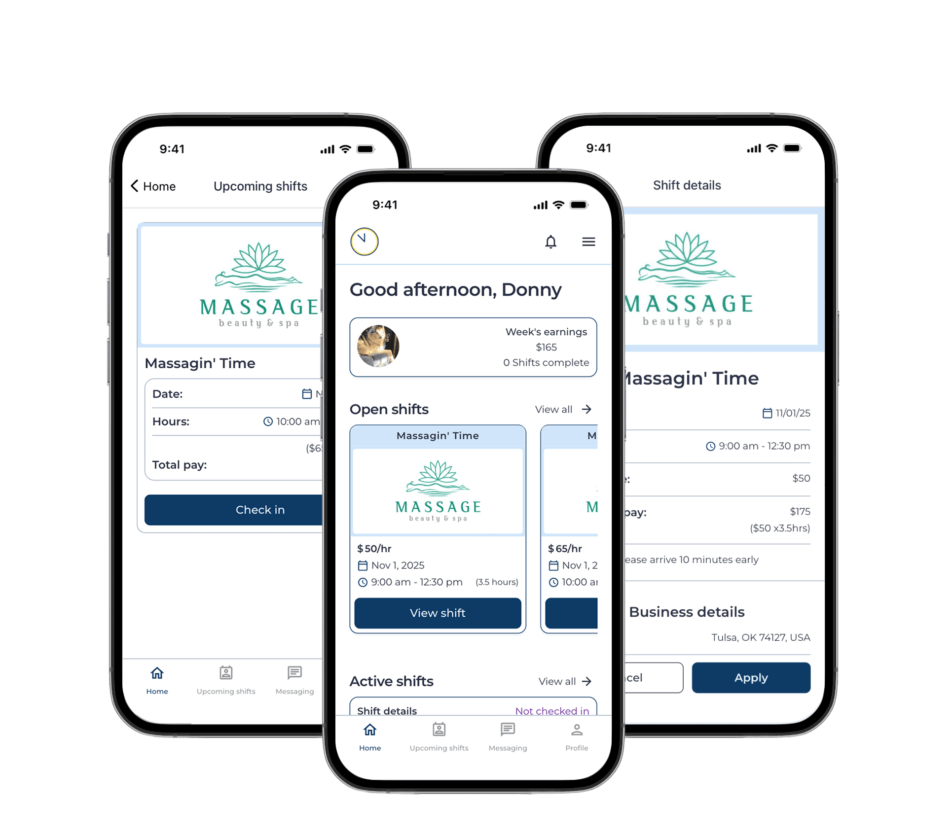
Key features:
Businesses can post, edit, and manage shifts
Therapists see available shifts, apply, and withdraw easily
Dashboards show applications, current and completed shifts, and earnings
Messaging lets users coordinate directly
All payouts and shift info are linked for clarity
Impact:
The app reached a fully functional MVP with all core workflows in place for both sides of the marketplace. Three early testers from the research phase validated the core flows, responding positively to how straightforward the experience was compared to the workarounds they currently use.
Shift posting, browsing, and applications working end-to-end
Messaging, check-in, and earnings tracking in place for both user types
Remaining features before launch are infrastructure dependent, not design gaps
Success will be measured by shifts filled, therapist retention, and time-to-coverage for businesses
Next steps:
We’re starting with beta users to sort out any real-world issues. Key steps:
Refining key flows and fixing pain points
Tracking metrics like user growth, shifts filled, and feedback
Expanding into new business types and regions based on adoption